

The Guide to Pricing Page Storytelling (5 common mistakes and how to fix them)
Plus: Pricing updates from Salesforce, SurveyMonkey, and Sprout Social.

Every week, we provide research and resources to help SaaS leaders make smarter pricing and packaging decisions. Get our latest research to stay ahead of the curve.
🔌 Good Better Best is powered by Lago
Multi-product, multi-entity, multi-geography, multi-everything. As you scale, billing gets more complex until homegrown systems crumble and you need to hire engineers just to keep using legacy vendors.
Lago is the open-source billing system that supports all common pricing models (including AI pricing like credits, usage, and outcome-based pricing) without turning billing into a nightmare.
Don’t tie yourself to a vendor. Lago lets you inspect the codebase, self-host on your own premises (or VPS) and customize anything you want.
Want to find out more about designing usage-based pricing models?
Sprout Social introduced a new Essentials tier.
SurveyMonkey added an AI-survey builder and market research features.
Salesforce raised prices on Marketing Cloud.
Webflow added a Code Components feature.
Vendr launched a free AI agent for negotiation support.
Explore more recent changes from Atlassian, Rippling, and Vercel at PricingSaaS →
📌 Monetization Mastery: Pricing & Packaging for SaaS Leaders
Ulrik and the team at Willingness to Pay are launching an exclusive 6-session online course where they will teach SaaS leaders exactly how they run a pricing project. The first cohort kicks off November 10th and is limited to 15 attendees. Don’t miss it.
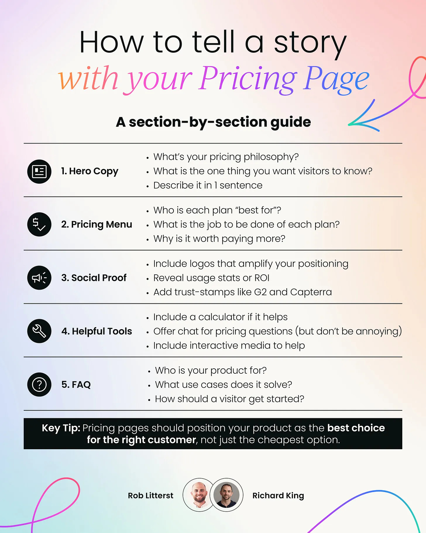
Pricing and product marketing are closely related.
When done well, pricing can play a massive part in your story and how your company differentiates from the rest of the market. But most companies simply use the pricing page as an information dump, not as a powerful storytelling vehicle.
This week, I partnered with Richard King — Founder of Product Marketing Alliance, and author of The Product Marketing Drop, to help fix this.
We broke down:
The key sections with the most storytelling potential
The most common mistakes we see
How to fix them
We also created a simple 1-page guide to make this easy.
Grab it at the bottom of this post 👇
1️⃣ The Hero Section
❌ Common Mistake: Many companies use their pricing page hero to state what their product does. This is unnecessary. Pricing page visitors usually have that context, and are further along in the consideration stage.
✅ The Fix: Lead with your pricing philosophy. If you don’t have one, you probably have an informal idea of what it is. Consider taking the next step and formally documenting it. It makes every future pricing decision easier if you can run it through your pricing philosophy as a filter.
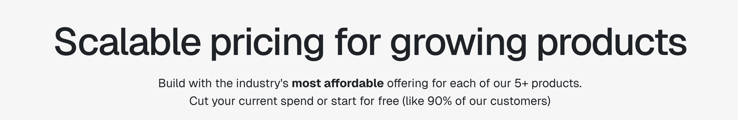
Take Statsig. Their headline captures their ICP (growing products) and their philosophy (scalable pricing). The sub-header reveals they are the most affordable option in the market, and 90% of customers get started for free.
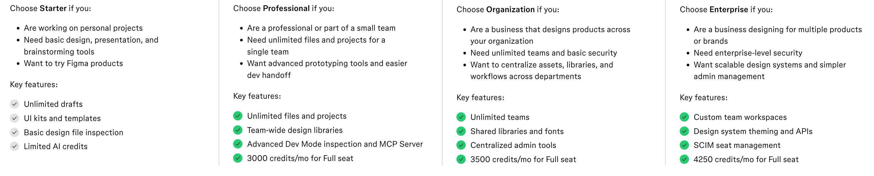
2️⃣ The Pricing Menu
❌ Common Mistake: Companies love putting everything and the kitchen sink in the main pricing menu. Not only is it not necessary, it’s redundant and unhelpful.
✅ The Fix: Highlight the 5-8 features and usage limits that help a visitor understand (1) what job each plan solves, (2) who each plan is best for, and (3) why it’s worth paying more for each subsequent plan. Figma does an excellent job here:
3️⃣ Social Proof
❌ Common Mistake: Many companies forego social proof altogether, and if they do, they drop a bland logo banner with a few (often random) customers. This is a missed opportunity.
✅ The Fix: With social proof, the more context the better. A customer logo is better than nothing, but even better than that? A logo showing which plan they use (MixPanel does this), or a testimonial from a user describing their use case.
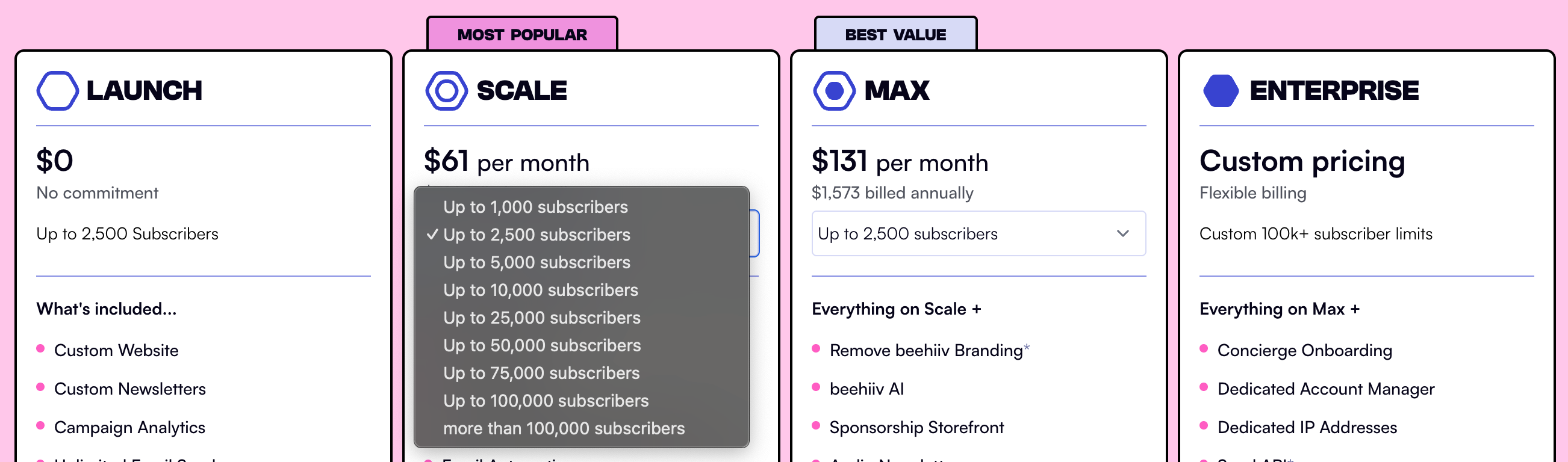
4️⃣ Interactive Tools
❌ Common Mistake: Many companies go way overboard with widgets and modules on their pricing page. As a regular pricing page visitor, it never ceases to amaze me how many pricing pages have a truly terrible UX that starts with multiple popups and an aggressive chatbot.
✅ The Fix: Strategically place helpful resources to make it easier for visitors to understand how much they’ll pay, and why they should choose a given plan. For example, beehiiv has a drop down with contact tiers that dynamically changes the price point. Monday.com links to a video explanation of why a visitor should consider its Standard and Pro plans. Simple additions like this help visitors get answers on their own terms.
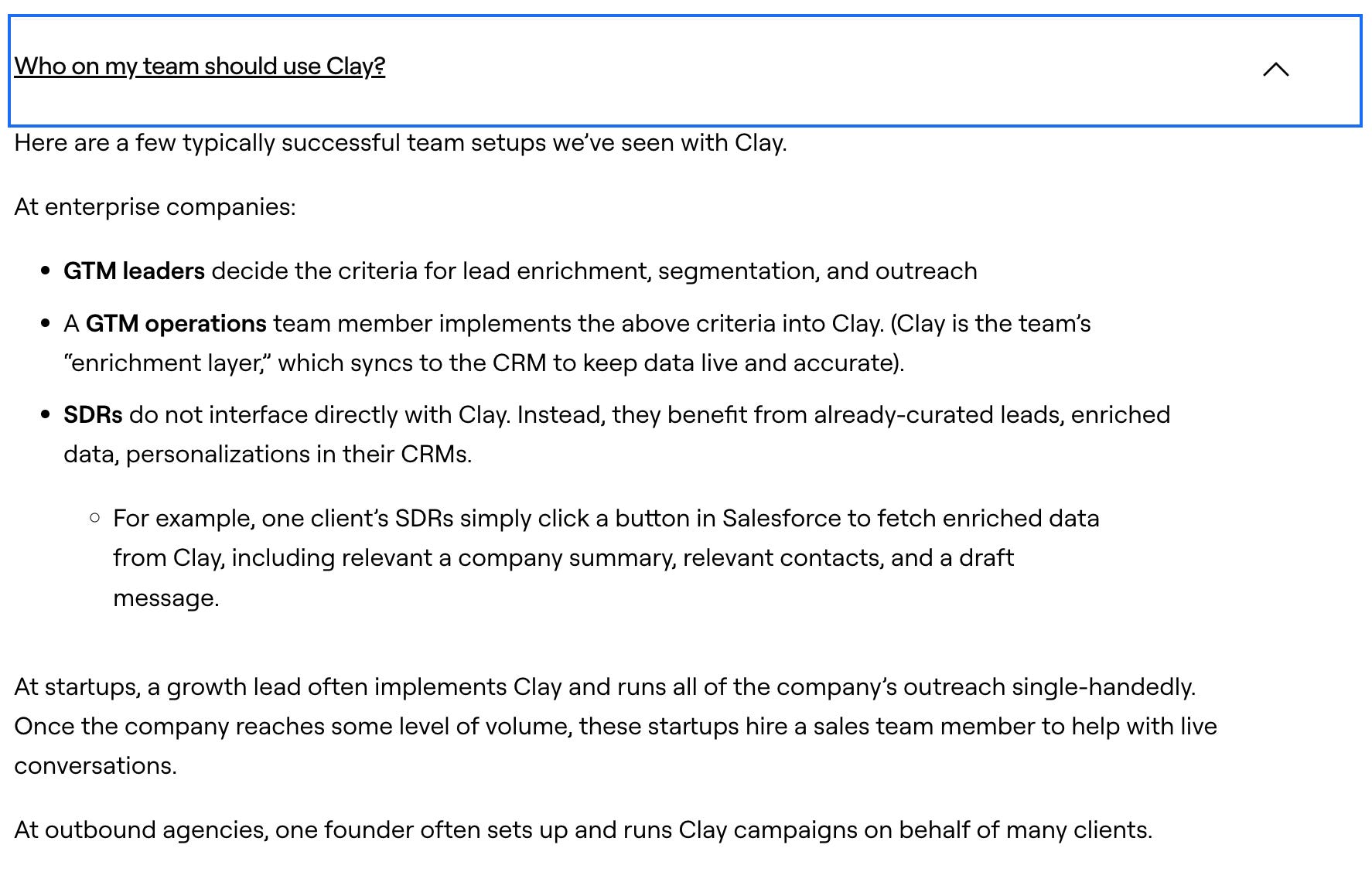
5️⃣ FAQ
❌ Common Mistake: Many companies reserve FAQ for payment and billing questions. Most SaaS companies have a similar approach to payment and billing, so this feels like wasted real estate.
✅ The Fix: FAQ is a great opportunity to address any higher-level questions about the product with more context. You can’t write a paragraph in the middle of your pricing page, but the FAQ section is a good place to go deeper. For example, Clay breaks down who uses Clay at various types of companies.
None of these changes are earth-shattering, but they will all help your pricing page do its job: deliver essential information as efficiently as possible so visitors can make a decision.
Rich and I created a simple cheatsheet to help make this easier. Grab it below, and if you could use a second set of eyes — book a strategy session.
Thanks for reading! When you’re ready, here’s how we can help:
PricingSaaS Community: Join the free PricingSaaS Community to get quick answers from experts, real-time pricing data, and access to exclusive events.
PricingSaaS Index: Check out the PricingSaaS Index to track competitors, scroll pricing histories, and create a swipe file of pricing pages for inspiration.
Free Advisory Session: Need a sounding board? Book a 30-minute session. No sales pitch. We’ll provide honest feedback and steer you in the right direction.