The Ultimate Guide to SaaS Pricing Pages
Changes from Synthesia, Speechmatics, Sketch, Semrush, and Runway.
Every week, we provide research and resources to help SaaS leaders make smarter pricing and packaging decisions. Get our latest research to stay ahead of the curve.
🔌 PricingSaaS Partners power the next era of SaaS pricing
DigitalRoute is hosting Usage Unlocked, a virtual roundtable for monetization leaders on 11/19. Register here →
Metronome shared the OpenAI Blueprint to AI Monetization.
Nue published a guide to mid-term pricing changes.
Schematic gathered top pricing thinkers to share their top AI pricing tactics.
Synthesia added a voice cloning feature.
Speechmatics added ‘best discounts’ for Enterprise customers.
Sketch raised prices.
Semrush rebranded plans as Semrush One with AI search features.
Runway added Workflows as a standard feature.
Explore more changes from Resemble, Renderforest, and Replit at PricingSaaS →
📌 Save the Date: Thursday, November 20th at 9am EST
Ulrik Lehrskov-Schmidt and the team at Willingness to Pay are hosting a webinar next Thursday on SaaS pricing for hardware companies. Register here →
The Ultimate Guide to SaaS Pricing Pages
My guest co-author today is Alexander Estner, GTM advisor for early-stage SaaS and AI founders on their way to the first $1 million ARR - and also the author of MRR Unlocked, where he’s sharing actionable GTM content.
👉 This guide might be too long for your email inbox; read it instead online here.
Today, we’ll break down great SaaS Pricing Pages:
1️⃣ The must-have and nice-to-have sections of great pricing pages
2️⃣ How can you optimize each section
3️⃣ Examples you can steal from.
Your pricing page is one of the most important on your website. For many visitors:
✅ It’s where interest turns into action, or
❌ Where confusion sends them to a competitor.
People visiting your pricing page aren’t starting from zero.
They’ve seen dozens of SaaS pricing pages, compared competitors, and know what information they want and where to find it.
That’s good news — you don’t need to reinvent the wheel.
The best pricing pages aren’t the most creative – they’re the clearest.
They meet expectations and give enough context to help someone confidently pick the right plan. Patrick Campbell, Founder of ProfitWell, said visitors should be able to decide which plan is right within 30 seconds. That’s the benchmark. If it takes longer, you’re probably overcomplicating it.
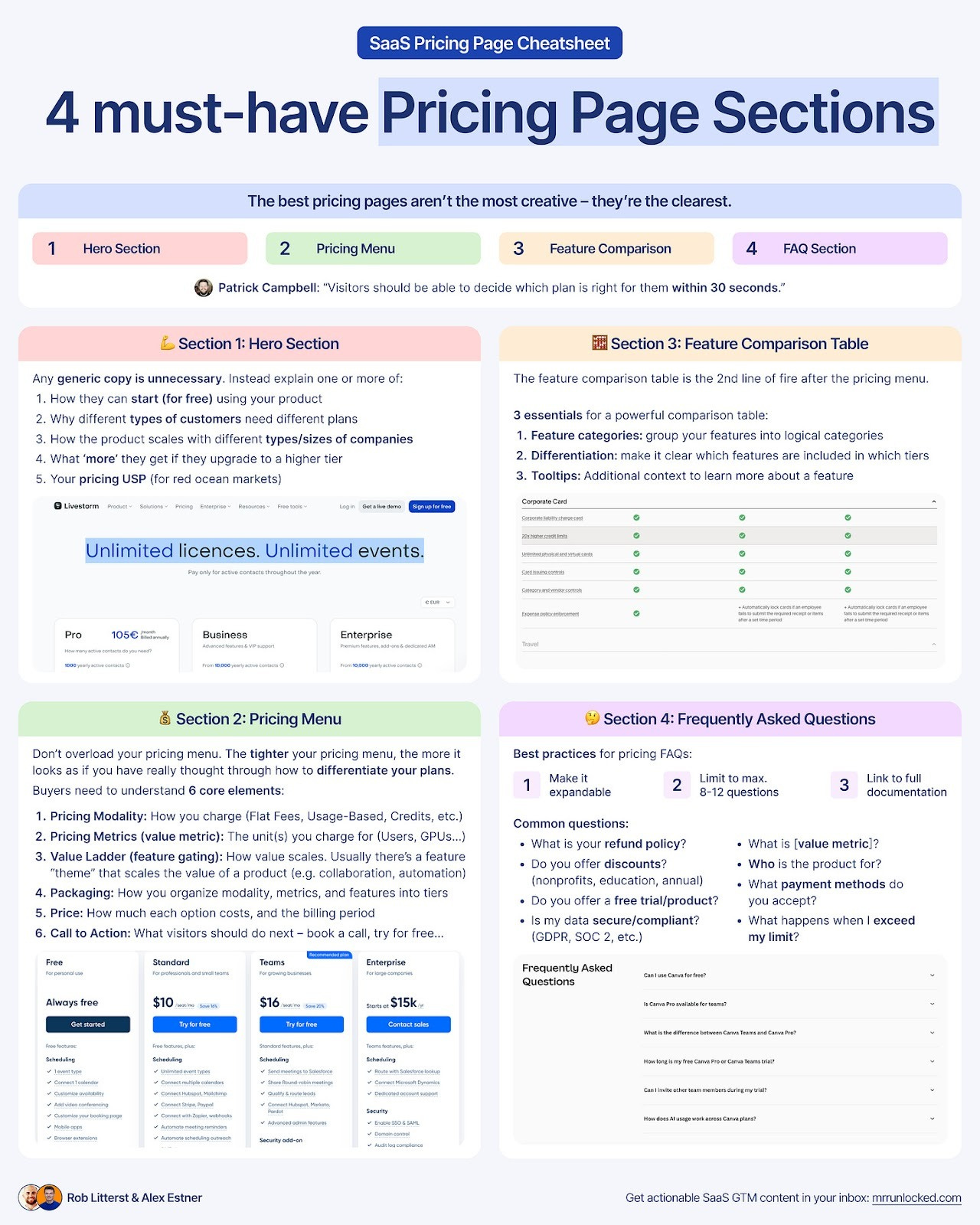
4 Must-Have Sections for your pricing page
This guide breaks down the four essential sections every SaaS pricing page needs:
1️⃣ Hero
2️⃣ Pricing Menu
3️⃣ Feature Comparison Table
4️⃣ FAQ
You don’t need a flashy pricing page — you need one that’s easy to understand. Show your value, clear up confusion, and make it effortless for visitors to take action, like starting a free plan or booking a demo.
Let’s get into it.
Section 1: Hero Section
The Hero section is the first thing people see on your pricing page — but it’s not the same as your homepage hero.
Unlike homepage visitors, people on your pricing page are already further down the funnel. They’re comparing options and deciding whether to buy, not learning what you do.
Because of that:
❌ You don’t need to restate what your product is.
❌ You don’t need long, generic company copy.
Instead, use this space to guide action and clarify value. Your hero can highlight:
1️⃣ How users can start (e.g., free trial or plan)
2️⃣ Why plans differ by customer type
3️⃣ How pricing scales with usage or company size
4️⃣ What’s added at higher tiers
5️⃣ A clear USP that differentiates your pricing (see Livestorm example below)
That’s what makes the section valuable.
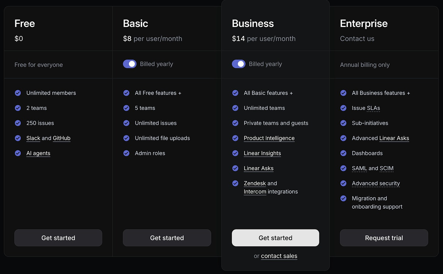
Example: Linear
The subheader explains how to get started and why to upgrade, instantly telling visitors:
1️⃣ There’s a free plan.
2️⃣ Pricing scales with issue volume.
3️⃣ Features define plan tiers.
This clarity helps users explore pricing with context.
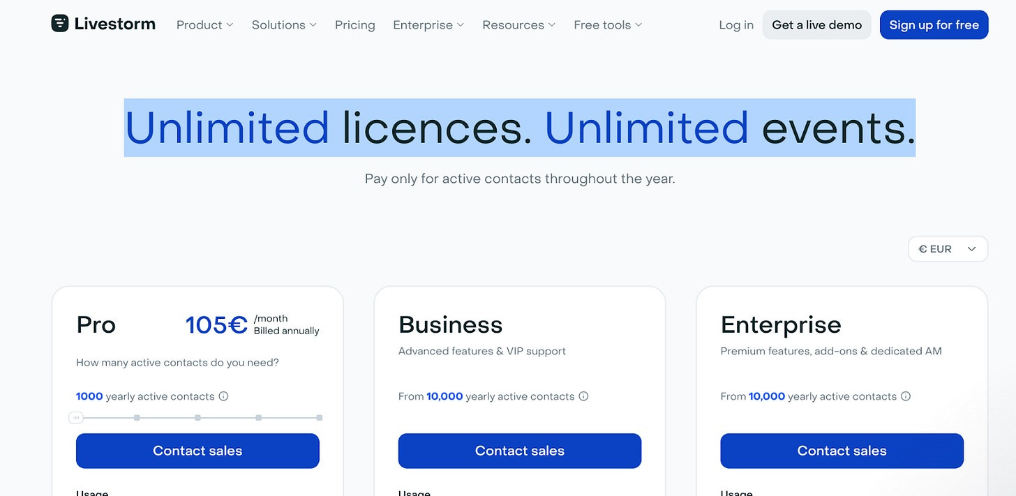
Livestorm takes another approach, emphasizing what they don’t limit:
“Unlimited licenses. Unlimited events.”
It’s a sharp way to stand out in a crowded market.
Clarify uses its hero to stress pricing by outcome, not by seats — a strong differentiator.
Section 2: Pricing Menu
The Pricing Menu is the core of your pricing page. Its job is to communicate essential information and help visitors quickly understand how they can work with you.
Many companies overload this section with too much detail — a common mistake. A tighter pricing menu actually signals that you’ve thought carefully about how to structure and differentiate your plans.
✅ Focus on showing the key levers and main differences that help someone see which plan fits them best.
❌ Avoid dumping every single feature or metric here.
Visitors don’t need a full comparison chart at this stage — that belongs in the feature table below. Repeating it up top just adds clutter and slows decision-making.
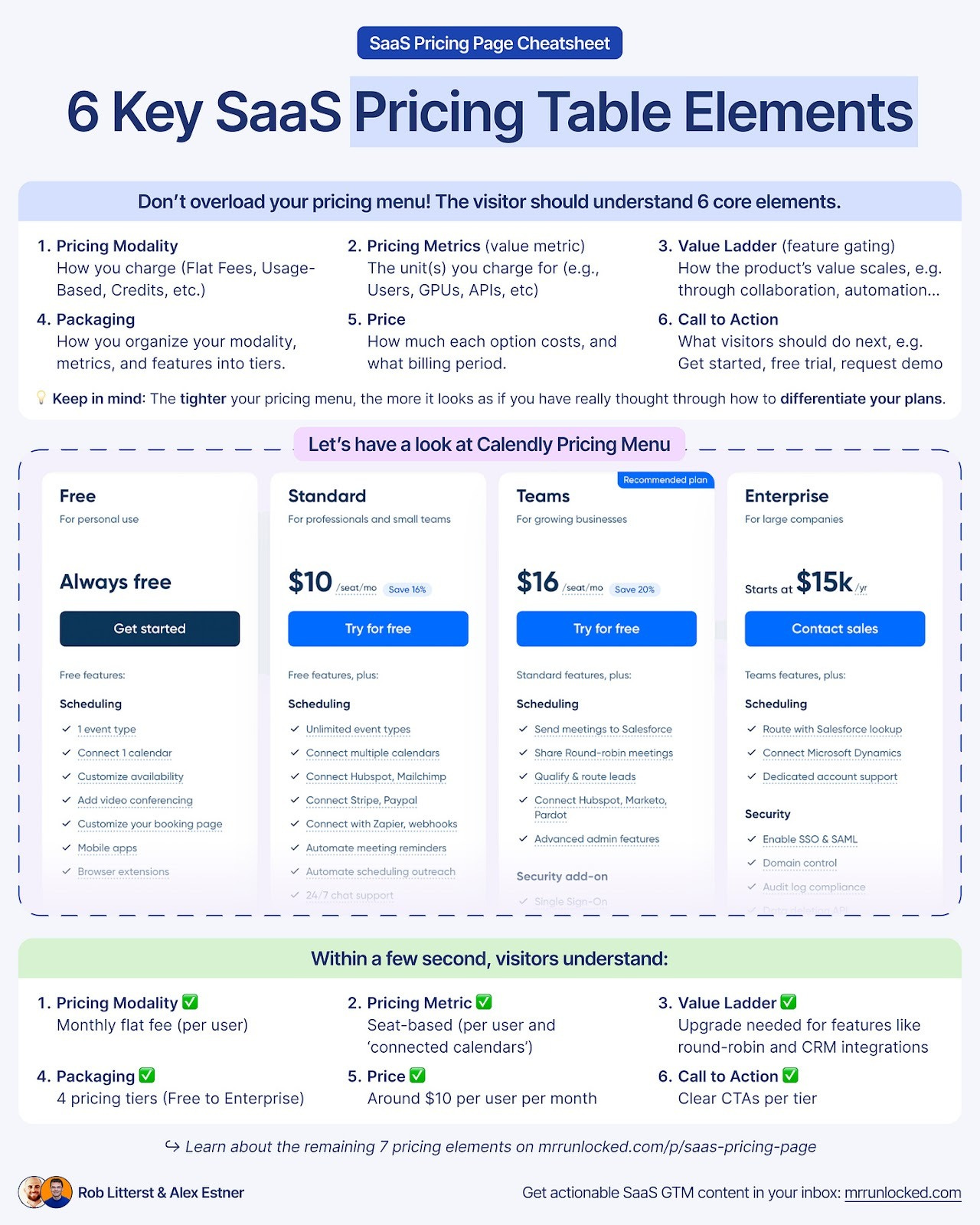
The pricing menu should include 6 core elements:
1️⃣ Pricing Modality
→ How you charge.
Options include Flat Fees (e.g. $50/month), Licenses (e.g. $50/month/user), Usage-Based (e.g. $.05 per contact), Credits (e.g. $100 for 1000 credits), or a combination.
2️⃣ Pricing Metrics (aka value metric)
→ The unit(s) you charge for (e.g., Users, GPUs, APIs, etc).
3️⃣ Value Ladder (aka. feature gating)
→ How value scales (e.g., collaboration, automation, governance, etc).
Usually, there’s a feature “theme” that scales the value of a product. Popular options are collaboration, automation, or sophistication. Make that clear in the pricing menu.
4️⃣ Packaging
→ How you organize your modality, metrics, and features into bundles, usually as discrete tiers. Although some companies don’t do this, they opt for ‘pay as you go’ or à la carte packaging.
5️⃣ Price
→ How much each option costs, and the billing period.
6️⃣ Call to Action
→ What visitors should do next. Usually, either get started, free trial, request a demo, or contact sales.
Your goal is to help visitors grasp how your pricing works — and what it will cost them — in under a minute, ideally within 30 seconds.
If you can achieve that without anything flashy, even better. Simplicity wins.
Linear does this exceptionally well, communicating everything with clarity and speed.
5 Pricing Menu Recommendations
Here’s how to organize the essentials of your pricing menu:
1️⃣ Keep Plan Names Simple
Don’t overthink naming — clarity beats creativity. If you want to add context, you can always use a “Best for” statement below the plan name (more on that below).
2️⃣ Show the Monthly Cost
Display the monthly cost right below the plan name (even for annual billing). Tie it clearly to your pricing metric so users immediately understand how cost scales.
3️⃣ Include the Billing Period
Always indicate how billing works. A toggle above the pricing grid (monthly ↔ yearly) is the standard and most intuitive approach.
4️⃣ Highlight Key Features and Usage Limits
After naming and pricing, call out the core features and usage thresholds for each plan. Keep it concise — aim for about five items. Focus on what truly drives pricing or differentiates plans.
5️⃣ Add Clear CTAs
Every plan needs a specific next step.
For free or PLG plans: “Get Started.”
For sales-led motions: “Request a Demo” or “Contact Sales.”
Different plans can have unique CTAs depending on your GTM model.
These are the essentials. If you can convey all key details across these elements, you don’t need anything extra. Keep it focused and simple.
7 Nice to have pricing menu elements
Beyond the essentials, you can add a few extras to make your pricing menu clearer and more persuasive.
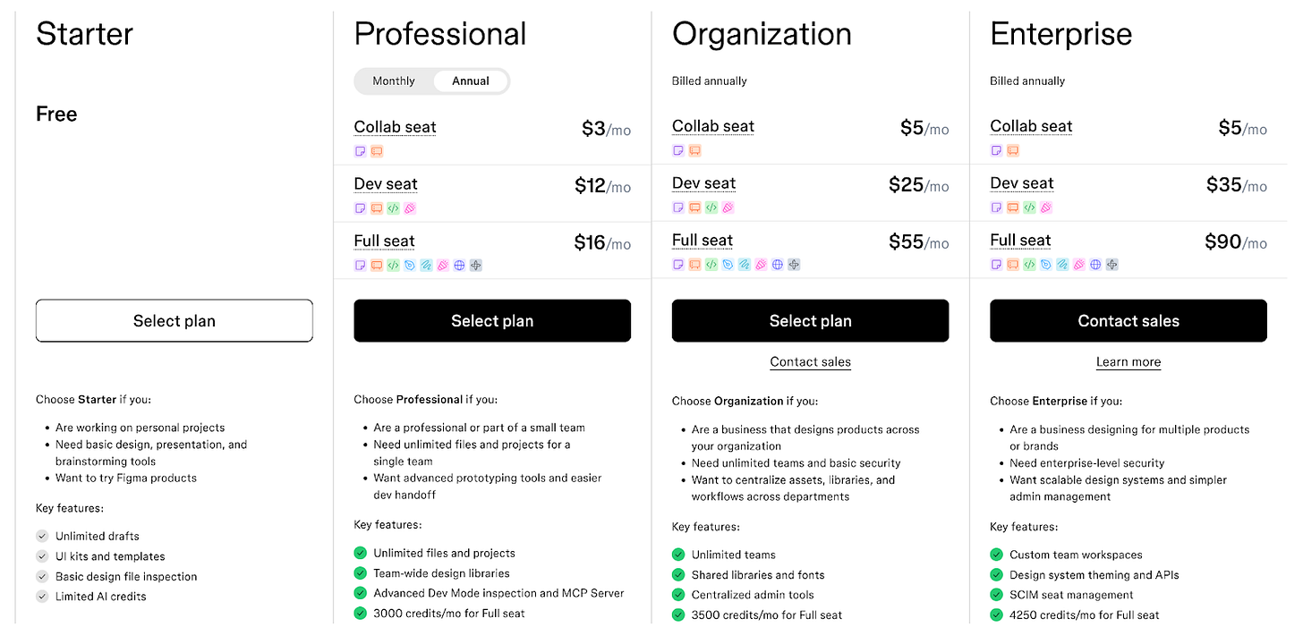
#1 “Best for” Statement
A short note under each plan explaining who it’s best for helps visitors choose faster. Ideally, users can tell this from the pricing alone — but if not, a “best for” label adds clarity.
Figma does this well:
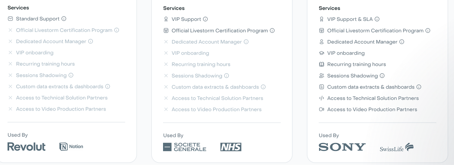
#2 Used by (Social Proof)
Show logos of companies using each plan to build trust and guide decisions. Livestorm adds this effectively.
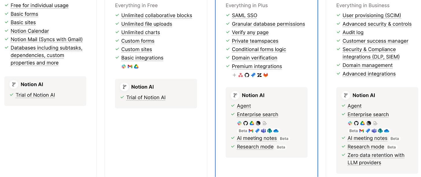
#3 Key Features
Emphasize standout features that define your product or pricing tiers. Notion, for example, showcases “Notion AI” in a dedicated section below its feature list, clarifying what each plan includes.
#4 Pricing Calculator
If your pricing depends on usage, offer customization tools. Sliders or dropdowns help visitors estimate cost based on needs.
Klaviyo adjusts prices dynamically by database size, message volume, and region.
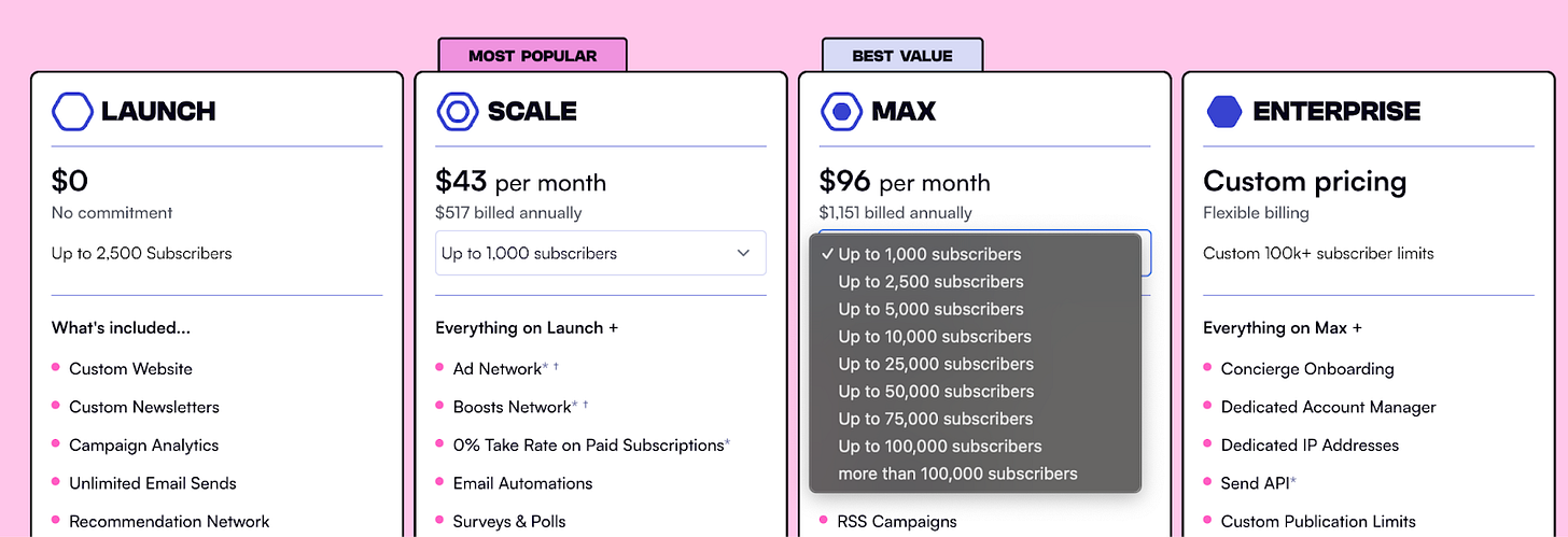
beehiiv uses dropdowns within plans to customize contact volumes and guide upgrades.
#5 Visual Differentiation
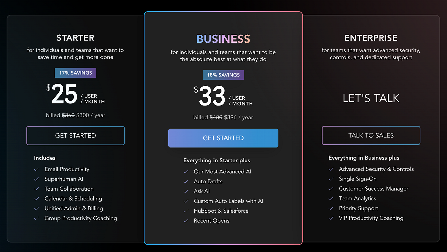
Use design to draw attention to a key plan. You can label it “Most Popular” or simply make it stand out visually — like Superhuman, which subtly emphasizes its Business plan.
Figma also uses icons to show which products come with each seat type, creating a simple visual legend.
#6 Enterprise Tier
Decide where and how to show your Enterprise plan. We recommend including it in the main grid — ideally with a “starts at” price. This has two benefits:
It makes comparisons easy while keeping add-ons separate.
It anchors pricing, making other tiers feel more affordable.
Lastly, if competitors hide Enterprise pricing, transparency becomes your advantage.
#7 Product Tabs
If you offer multiple products or personas, use tabs above your pricing grid to organize them.
Toast separates pricing for restaurants and retail, while HubSpot highlights bundle options for customers purchasing multiple products.
Section 3: Feature Comparison Table
The feature comparison table is your pricing page’s second line of defense.
Your main pricing menu should give visitors the 80/20. For anything more detailed — specific features, limits, or usage rules — the comparison table fills the gaps.
It’s a simple component, but there are a few essentials to get right.
4 Essential Elements of a Feature Comparison Table
#1 Feature Categories
Group features into logical sections. This helps users scan easily and understand scope at a glance.
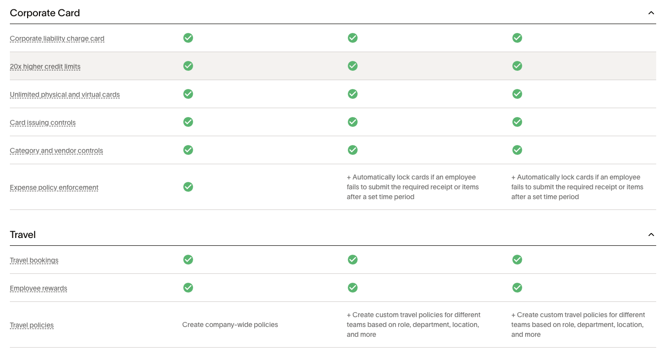
Ramp does this well, organizing its table into clear buckets like Corporate Card, Travel, Expense Management, Accounts Payable, Procurement, Treasury, and Accounting.
#2 Clear Differentiation
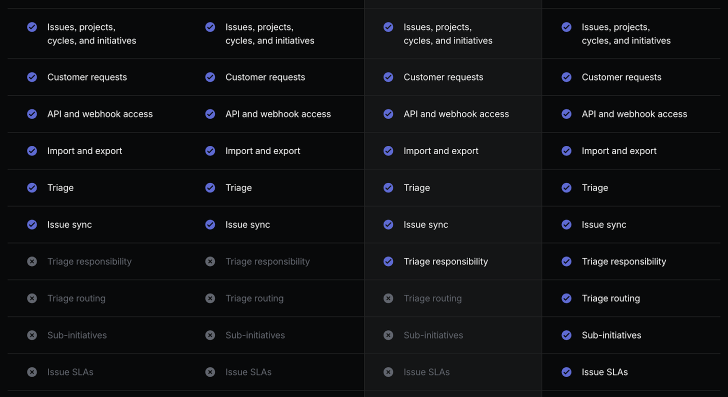
Show exactly which features belong to which plan. Most teams use checkmarks or Xs; Linear combines both with shading for extra clarity.
#3 Tooltips
If feature names aren’t instantly clear, add context through tooltips or hover states — like info icons, dotted underlines, or asterisks. Loom uses this approach effectively for “Auto-video enhancement.”
# 4 Expandable Navigation
Expandable tables make long feature lists easier to browse.
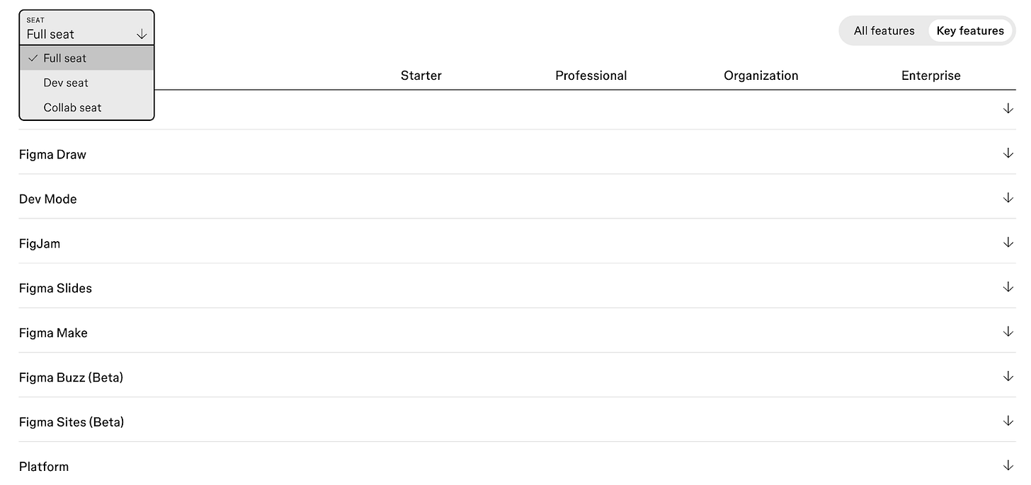
Asana lets visitors expand the entire table, while Figma allows expanding by feature category.
Figma also offers a view by seat type and keeps plan names fixed with a sticky header — so visitors never lose track of which plan they’re comparing.
Section 4: FAQ
The FAQ section is your final line of defense before someone contacts sales. By this point, 99% of a visitor’s questions should already be answered.
The flow should work like this:
The Pricing Menu covers core information (80%).
The Feature Comparison Table clears up any feature or usage confusion (90%).
The FAQ resolves whatever’s left (95%).
With each scroll, you should be removing ambiguity for the visitor.
Best Practices for FAQs
Use an accordion format — it keeps things clean and prevents a wall of text.
Stick to 8–12 questions max. More than that usually means your page above isn’t clear enough.
Link to full documentation — help center articles or support pages add depth without cluttering the layout.
While FAQs vary by industry, a few common questions are worth including:
What is your value metric?
→ Define exactly how pricing is measured. Livestorm, for example, charges based on “active contacts.”.
Who is the product for?
→ Reinforce your ideal customers or use cases. Clay handles this nicely.
Do you offer a free trial or free product?
→ If so, include it — even LLMs use this info to interpret your pricing. Canva does this well.
Billing and Payment Questions (universally relevant):
What happens if I exceed my limit?
What’s your refund policy?
Do you offer discounts (nonprofit, education, annual)?
What payment methods do you accept?
Is my data secure/compliant (GDPR, SOC 2, etc.)?
Clay’s FAQ is a strong example — concise, well-organized, and offering just enough product context to close the loop.
Optional Sections for your Pricing Page
The sections above are essential, but a few optional ones can enhance clarity and trust.
# 1 Social Proof
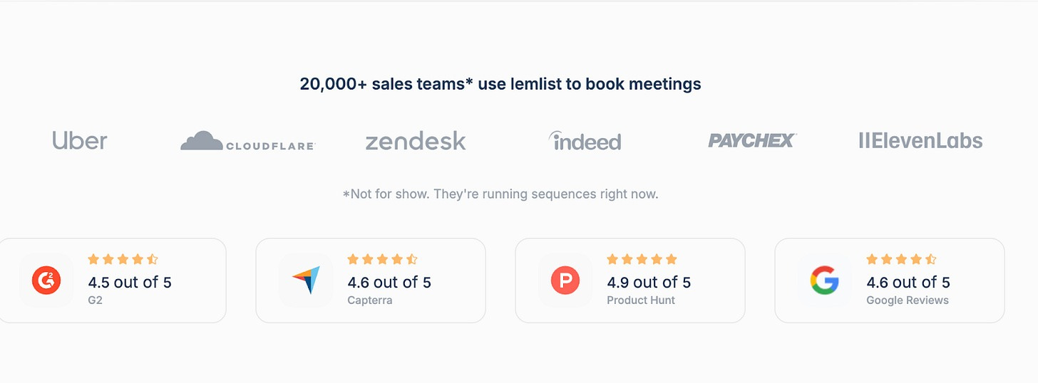
Logo walls, testimonials, stats, or G2/Capterra ratings add credibility.
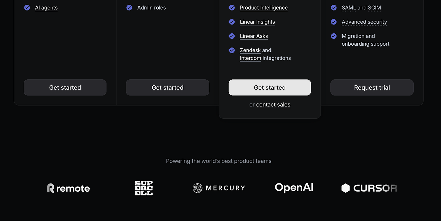
Relevant logos reinforce positioning — for instance, showing OpenAI as a customer signals innovation.
#2 Add-ons and Professional Services
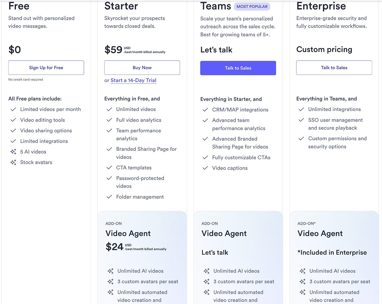
You can either list add-ons directly on the pricing page or link to a separate page. Intercom and Vidyard both integrate them directly into their pricing layouts.
Intercom
Vidyard
#3 Pricing Calculator
Useful when multiple variables affect cost. HubSpot links to a calculator from its pricing page to help visitors estimate pricing for different products and terms.
#4 Discounted Plans (Startups, NGOs)
If you serve startups or nonprofits, consider special pricing. Asana offers 50% off for NGOs.
#5 Chat Widget
Embedding live chat helps answer last-minute questions and route leads to sales — just ensure it’s reliable, staffed consistently, and doesn’t include obnoxious pop ups.
#6 Trust Signals Footer
Badges for security, compliance, or payment options build confidence. Miro, for example, includes a “Security & Compliance” section in its footer.
Conclusion
Great pricing pages aren’t inventive — they’re clear.
Use this simple structure:
Hero: sets context
Pricing Menu: shares essentials
Feature Table: clarifies details
FAQ: answers what’s left
If visitors understand your pricing and see their fit in under a minute, you’ve succeeded. Keep it simple, gather feedback, and refine. Clarity always wins over complexity.
Thanks for reading! When you’re ready, here’s how we can help:
PricingSaaS Community: Join the free PricingSaaS Community to get quick answers from experts, real-time pricing data, and access to exclusive events.
PricingSaaS Index: Check out the PricingSaaS Index to track competitors, scroll pricing histories, and create a swipe file of pricing pages for inspiration.
Free Advisory Session: Need a sounding board? Book a 30-minute session. No sales pitch. We’ll provide honest feedback and steer you in the right direction.

















Thanks for the great collab! Enjoyed our episode a lot.
Are you saying that we shouldn’t have a FAQ item that says “can I upgrade at any time?” 😂